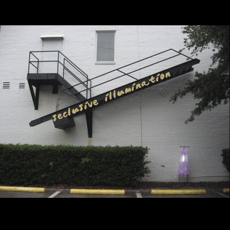
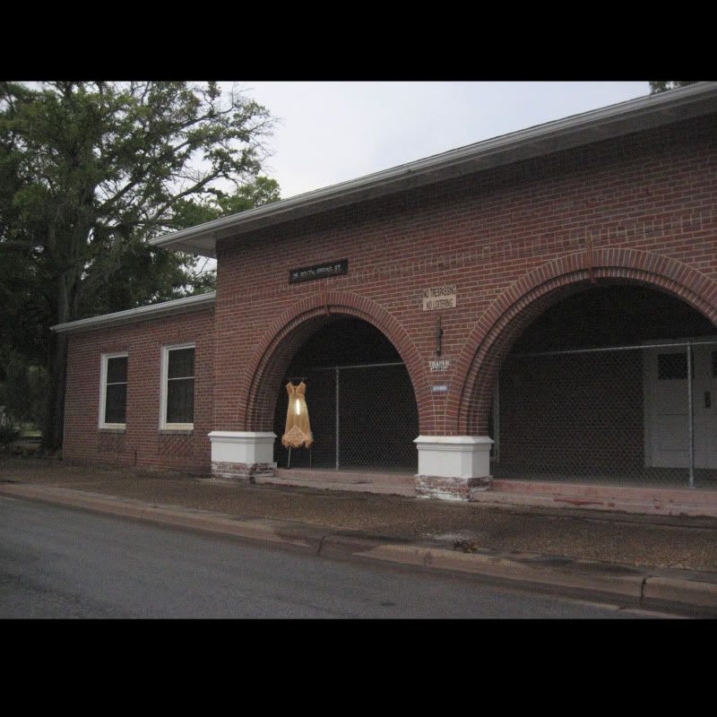
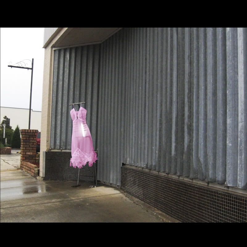
meditative quiet illuminated dress stands alone anywhere i might be.
i'm going to use the blurb site to create a book. thinking about maybe attaching an envelope with dress swatches in it. love the idea of being able to touch the dress viewer is seeing.
page 4
page 6
page 7
page 8
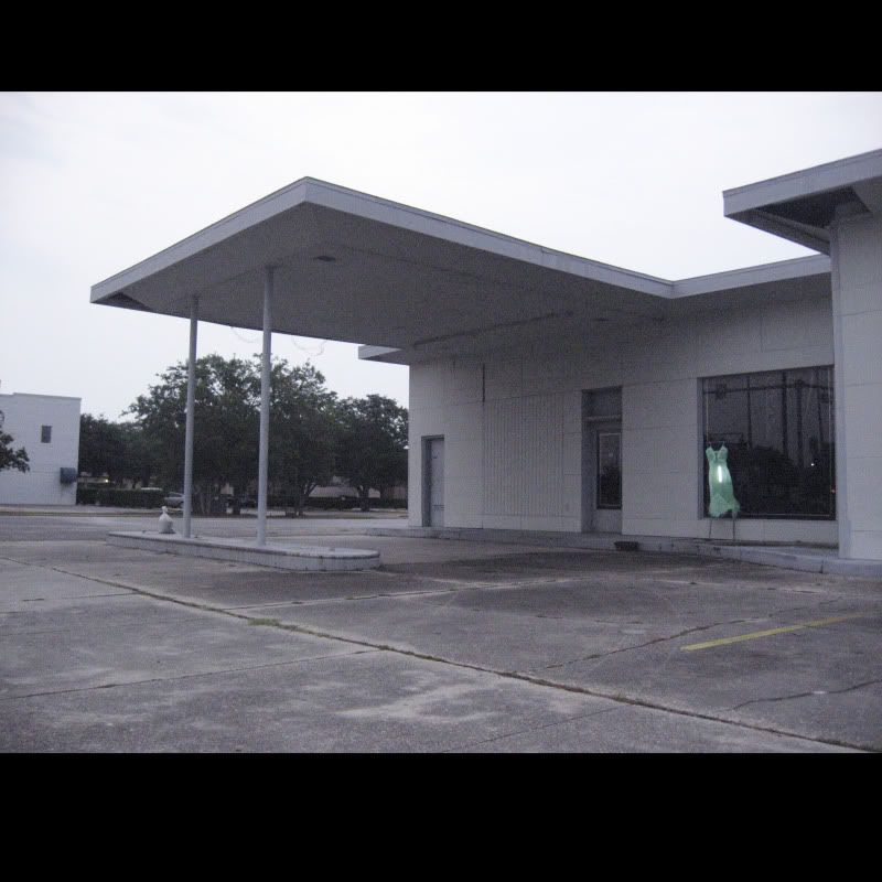
page 9
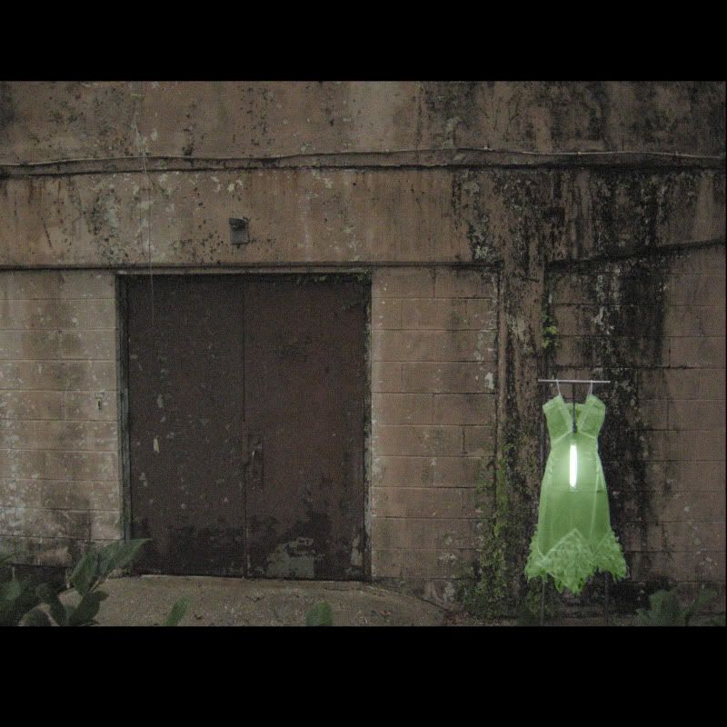
page 10
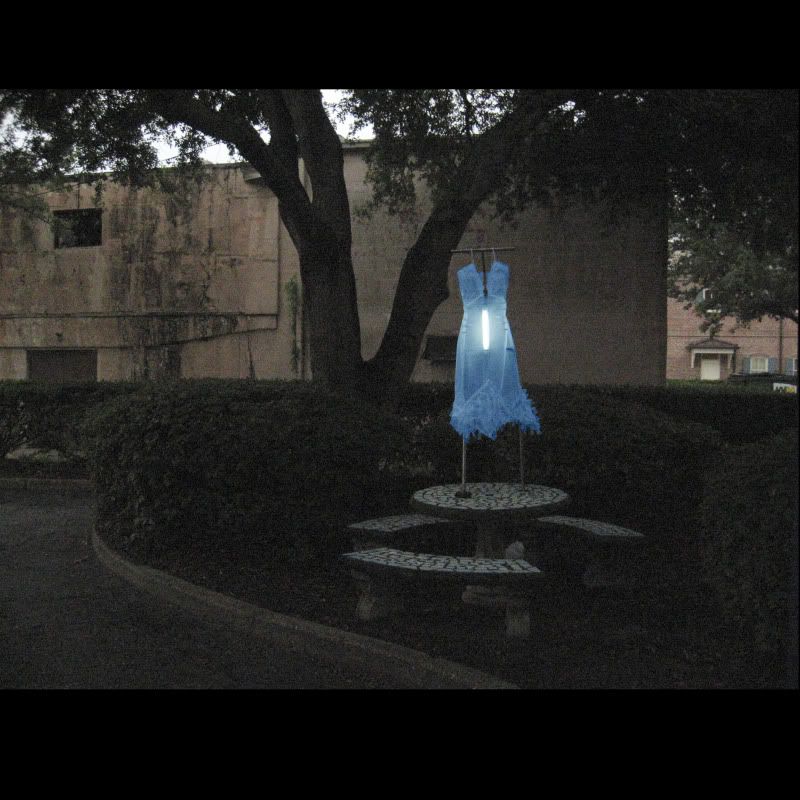


Kyla,
ReplyDeleteThat dress is gorgeous!
I am only hesitating on the font. I would rather it be your real handwriting than fake handwriting.
I would encourage you to visit tffany, rezvan, ian, josh or sam for a few tips for the cover. There may be a better photo that gives you more room to play with the font.
Oh that dress is gorgeous!
x,
val
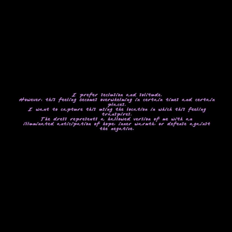
Very good on the dress and locations. It's kind of creepy but cool. I'm having some trouble reading the font that you used for the artist statement. Maybe something a little simpler? Or even as Val suggested writing it yourself. Keep it up!
ReplyDelete-Sarah
wow. this is very nice. looking good too. How did you get the frame for clothes? the dress is also nice.
ReplyDeleteThe dress is really beautiful and I'm loving all the pictures you have of it so far. How are you getting the different colors?
ReplyDeleteI also like the idea of using your handwriting as opposed to a handwriting font.
the tighter shots are my faves, i think they work better than the super wide shots. for your artist statement, maybe justify the text rather than center align it. that or make each line closer to the same width.
ReplyDeletethese are just ridiculously cool images! how's the dress changing colors? that dress form is way cooler than i imagined when you told me about it.
ReplyDeleteI definitely agree with everything Val said. WOW! I can't get over how beautiful these pictures are.
ReplyDeleteur dress is great and the locations work well, the only suggestion would be changing the text to maybe something more simple or either ur handwriting. keep going!
ReplyDeleteI really like all of your locations.
ReplyDeleteEverything looks great all together now! I love how the dress seems to take on different colors almost in the different settings. I agree with some other comments that the font is not the best. Try playing with some different fonts for the cover and artist statement.
ReplyDeleteDanielle
the photos are getting a lot stronger. the locations you are picking out work really well. i think there could be another photo that would work a bit better for the cover. but so far everything looks good in the photographs.
ReplyDeletethe photos of my coffee table will be mounted on my coffee table.
These are all beautiful. Layout looks great. The change in the dress color keeps it interesting. And you locations are awesome, keep it up.
ReplyDeleteIt seems as if you’re coming along quite nicely with your artist book. I especially like page 9 of your artist book.
ReplyDelete--Nick Miller
The illuminated dress is an amazing concept. I do like the up close and personal images more than the long shots. Keep working on your font. The glow of the letters is connecting with the glow of the dress.
ReplyDeleteGreat vision!
Elaine
That dress is really pretty!! You should definitely continue designing! You are great at it!! The pictures are beautiful! I love how it is the same dress but with a different color of illumination! The cover looks great! Keep up the great work! :D
ReplyDeleteLove all of the different locations you chose! The last photo with the blue dress is my favorite! The lighting under the dress also adds a neat affect to the photos.
ReplyDelete