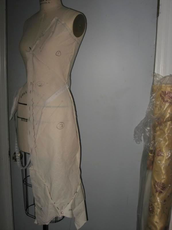
meditative quiet illuminated dress stands alone anywhere i might be.
i'm going to use the blurb site to create a book. thinking about maybe attaching an envelope with dress swatches in it. love the idea of being able to touch the dress viewer is seeing.


Amazing idea. I want to see more destination shots. The dress is going to look great, so I'm getting excited to see the finished product. Please don't use that font. .. it's so hard to read! If you look on dafont.com, there are some really pretty calligraphy fonts that are clean and easy to read.
ReplyDeleteThis is going to be beautiful! I was looking through your photos and trying to picture the dress in each of them. It gave me sort of a creepy feeling. Maybe that's what you're going for? oh, and I had a hard time reading the font. This is my favorite idea by far! Excited to see more!
ReplyDeletewow! is that you made? this is cool. you got a skill. This will be going to be aswsome. if this picture were blighten, i will be better.
ReplyDeleteThe font in your artist book blog is a little hard to read. Your shots so far are coming out quite nice.
ReplyDelete--Nick Miller
I had a very had time reading the font, so I think I different font would be to your benefit. I can't wait to see the dress!
ReplyDelete-Sarah
ditto on the font. looks like it's coming along well though. good pictures, and looking forward to seeing the dress completed.
ReplyDeleteGina
def dont use that font ha.
ReplyDeletei like your vision for the dress, i think it looks good. the shots are ok, keep looking around. when i drive i constantly look for possible places to shoot, you probably do the same, keep doin it, youll find some cool locations.
UPPER CASE FONTS ARE ALWAYS HARDER TO READ. Plus, I don't think you want to YELL at someone before you share your story. That would immediately put the viewer on the defense. Will all your settings be isolated?
ReplyDeleteElaine
Nope--not that font. All the above is good advice!
ReplyDeletei am excited-- keep going!
val
I'm excited to see some pics! I wouldn't mind the font if the text was minimal but it's hard to read so I would advise a different font.
ReplyDeleteI love how you are using a variety of different locations! I can't wait to see more pics where you incorporate the dress into them! I'm not crazy about the font though, I actually can't read it very well! Sorry! But your book is going great so far! Keep up the great work!
ReplyDeleteMelissa :)
these locations are really eerie. very awesome unless you are going for something else. that font is way too complex.
ReplyDeletealex